The complexity of the uRADMonitor system stretches from a multitude of compact hardware detectors capable of sensing the invisible ionising radiation and air quality, to the big data software solutions that can handle the huge amounts of data in real time. With the network spreading at a fast pace, periodic upgrades on the server side are a must, in order to provide a high quality, uninterrupted service.

This uRADMonitor server upgrade improves both the backend and the frontend. While the former brings a more efficient big-data-ready database implementation and RESTFul APIs for robust data access, the latter was shaped in a modern user interface with animated maps and interactive charts. The Backend and the Frontend are hosted on separated servers.
The Backend or data.uradmonitor.com
This is a separate server, in charge of the system database and the uRADMonitor RESTful APIs. It’s purpose is to provide input/output real time data operations via a mature API interface. It receives data from the distributed detectors, and provides data to the frontend, mobile apps and other parties, all via API calls. The data is stored in a big-data ready database.

The RESTful API methods are properly organised, and the code can be extended to support additional calls. Currently the following APIs are supported, all using JSON formatted data:
[POST] http://data.uradmonitor.com/api/v1/upload/e1/[encrypted data] , used by the uRADMonitor units to upload data
[GET] http://data.uradmonitor.com/api/v1/devices , used to retrieve the content of the summary table, the complete list of units in the network and their basic parameters
[GET] http://data.uradmonitor.com/api/v1/devices/[id] , used to retrieve the list of supported sensors for the specified unit ID
[GET] http://data.uradmonitor.com/api/v1/devices/[id]/[sensor]/[timeinterval] , used to retrieve the measurements for the given ID, sensor and time interval.

Here are a few examples, click to see the output:
http://data.uradmonitor.com/api/v1/devices
http://data.uradmonitor.com/api/v1/devices/93000001
http://data.uradmonitor.com/api/v1/devices/110000AA
http://data.uradmonitor.com/api/v1/devices/110000AA/cpm
http://data.uradmonitor.com/api/v1/devices/110000AA/cpm/604800
The Frontend or www.uradmonitor.com
This is the visible side of the centralised server system, as it is in charge of generating the webpage showing all radiation and air quality readings. The webpage is a modern implementation using the powerful OpenLayers 3 mapping library. Thanks to JQuery and Dygraphs the data is shown in interactive charts, this time generated on the client side to allow features like local timezone mapping and zooming, highly requested among uRADMonitor users.
The Clusters
Because of the high number of units on the map, close to 300 uRADMonitor units at the time of writing this article, representing all at far zoom out is impossible, due to obvious overlapping. The solution was to group the close units in clusters, automatically, based on the zoom level. The individual units are represented by circles, while the clusters are pentagons. The bigger the pentagons, the more units they are composed of. Clicking a cluster will unveil its comprising units automatically, by zooming the map to that particular location:

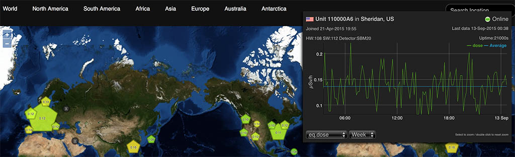
Clicking the highlighted big cluster on the Eastern US territory will zoom the map automatically so the comprising units become visible:

The colors are a gradient going from green to red, representing the Equivalent Radiation dose in uSv/h measured by that particular detector for the last 24 hours. For clusters, an average between all units contained is calculated instead, while the same color representation is used. Offline units are shown in black.
Clicking each individual unit opens a popup, where you can see the interactive chart, and can select the other sensors or a different timeframe. The charts support zooming, by selecting a portion of interest on the chart (click and drag).

The chart lines are shown in green while the average is blue. The details show the time the unit joined the network and the last time data was received. The firmware version and the hardware revision versions are also shown. The resolution is set to 10minutes maximum.

The map menu can be used to jump to various geographical areas, while the “Search location” box takes in any address and resolves the location to geographical coordinates, to jump to the specified place.

Next steps
There are a few improvements planned already, such as showing the units in close proximity (list of closest units and distance to them), full screen charts, comparison between various values and stations, and most important, allowing users to manage their own stations by changing location coordinates or setting alarm thresholds (eg. for radiation or air quality readings). Feel free to post a comment for any ideas you’d like to see implemented.

Hey Radhoo, Absolutely brilliant work! It’s very professional looking and responsive. You’ll recall my earlier thoughts about securing nodes against manipulation.
I’d love to see a time-lapse view of the map. It might be chillingly interesting one day to see spurts of red bubbling out of a spot, and sweeping across the continent. I think in this day and age, you don’t need to do most visualization work on your server. You can just send raw data, and let the app in our browser do it locally. I think that’s what sites like Weatherspark do.
I see many of the now-offline nodes are located in oppressive countries or otherwise sensitive locations… I hate to think what might have happened to them! In the event of a nuclear incident, many powerful people will want exclusive control of information about it. Corrupt energy corporations, let’s say. I think it would be good to work under the assumption that your nodes will be targeted online, and in real space. You should consider end-to-end vectors for surveillance, man-in-middle alteration, and decoy nodes. Also the breach of your servers, or just plain DOS.
It would be a good policy to observe anonymity for all nodes by default. While they’re all trackable because they call home to the same backend server, you can minimize exposure. On the Internet, the nodes should send their data POST to your server using PFE, so there is no persistent key to grab. A darknet (VPN or Tor) hop would be beneficial – set up a native .onion address for your server, too. No-one needs to know where your server is located. One day there may be an alternative like using a cooperative major news website as a proxy to obfuscate the fact that you have a node. Nothing suspicious about checking CNN every 10 mins, right?
When set up, a node’s geolocation should be offset by several km at random so no-one can be sent out in a humvee to spend an afternoon knocking them out. Don’t store the community’s personal details or credentials on the server. Just hashes that can be matched with what the nodes send for verification. Explore the options for federating server work across the network. Perhaps nodes can store their own month’s worth of data and reply to queries like part of a torrent. Some kind of solution should be found to ensure that only genuine nodes can participate.
Though it might be problematic for anonymity, I’d still love to see you publish an open source specification so others may build compatible nodes for your network. Calibration could be achieved by setting up such a node next to a urad node for a time, and calculating it’s offset. And see if other rad networks will share their data with you too. There are likely a number of public rad monitors that aren’t widely publicized, at universities probably. Pool them all in.
Looking good Radu 🙂
Great work Radu.
Thank you for letting us know how the server work.
One question : how do i read the date and time on this {“time”:”1441608603″,”cpm”:”20″} ?
Will there be a option to embed the different graphs on my own homepage? Like with the old API where I could embed the pictures from your graph generator.
Hello all, sorry for the late reply, and thanks for your nice words and feedback.
@Seth I really hope that the new features I’m working on – notifications and alarms (both for dangerous levels and offline units) will convince the users to plug the units back in. The notifications will be sent periodically, based on some settings in the user’s control panel, but should be a good reminder for those with black markers on the map.
There’s been some good progress on security as well, with all data uploaded by the units being now encrypted. Nevertheless protection is never too much, so I’ll do my best to improve things further.
@Yves: that timestamp is standard UNIX time. See https://en.wikipedia.org/wiki/Unix_time and let me know if you need additional help.
@Mads, that is not yet implemented, but will be soon, this time on the client side! This monday there’s a deadline for Hackaday prize competition, and have pushed all resources in that direction. But we’ll have a better API soon, to implement your requirements as well. Meanwhile, I’ve just added a direct access link, with the open parameter, see: http://www.uradmonitor.com/?open=11000003